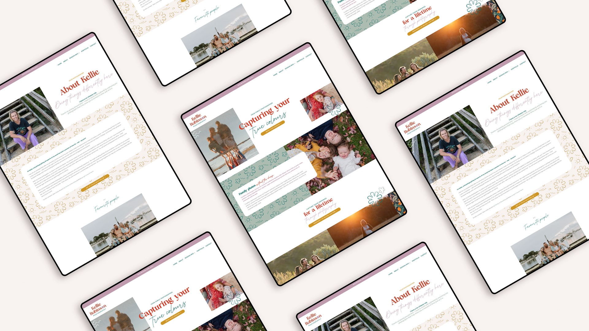
A fresh new look as Kellie from Kellie Robinson Photography rebrands from Colour of Life Photography and embraces her name.

Kellie was my very first client, back in 2015, when I was first starting out as a designer. So when she came to me with the idea of rebranding, I was so excited to be in a full circle moment. Kellie wanted to breathe new life into her business and she figured the best way was to rebrand. The process saw us dive deep and the result is going back to her roots, embracing her name, rather than a business name and a fresh new colour palette. The colour palette represents her feng shui element and incorporated colours and takes inspiration from her love of travelling.
The project saw us rebranding her visual identity, creating a new logo, font & colour palette, a set of custom illustrations and patterns. From there we then gave her Divi website a reskin with her new design elements. This project has been a really special one for me, and we both love the final outcome.

I worked with Kate 8 years ago with my first re-brand so when it was time to re-boot & re-brand my business again, I knew exactly where to head. The talent, creativity and professionalism that Kate shares during this process is second to none and I always know I am in good hands as she takes the time to thoroughly get to know what it is I want and need. Thanks Kate for your patience and fresh ideas as we sifted through concept after concept when it came to brand colours as I felt I knew what I wanted but not quite sure how to get there. Well get there we did and boy am I pleased we stuck at it because the results are astonishing having landed on something I never considered yet still feels so true to my brand. I love how we both trusted the process and watched it unfold organically - you truly do know how to weave magic with your work Kate. Thank you - forever grateful.